Charm City, as she likes to be called, has been the dystopian star of the wonderful television show The Wire, as well as a muse for both John Waters and Barry Levinson. I'm talking about Baltimore.
Over the years, some of the teams that have inhabited Baltimore have been given violent names, or at least violent sounding names, relative to other cities and the times. I've got a few of the logos here.
At one point, both these teams inhabited the city at the same time in the '70s.
The first in a WHA hockey team, the Baltimore Blades. The WHA was an upstart rival to the better known NHL, and was eventually absorbed into the older rival, with a few teams getting added, like the Edmonton Oilers, the Hartford Whalers (now the Carolina Hurricanes), the Winnepeg Jets (now the Phoenix Coyotes) and the Quebec Nordiques (now the Colorado Avalanche).
The Blades just didn't survive the merger. Their logo isn't too bad, though. Actually, I like it. maybe go with blue and you've got a cool "B" hockey logo:

Ag that same time the Chicago Zephyrs of the NBA had left Lake Michigan's shore and moved to Baltimore, becoming the Bullets.
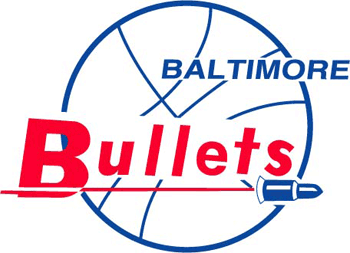
They eventually changed the logo, and for those NBA fans from the '80s, you'll probably remember this:

This is what that original changed to, and it stayed like that in Baltimore until they left for Washington DC. That was the DC logo as well, and it stayed that way until the mounting deaths-by-murder in the nation's capital made a mascot of a bullet distasteful.
After a vote, they'd been rebranded as the Washington Wizards, one of the worst nicknames and mascots in major American sports. Fortunately they're currently choosing alternate logos that are hearkening back to a time when the logo wasn't such an embarrassment.

It's a step in the right direction, at least.
No comments:
Post a Comment