While I'm from northern California, my father is from New York, and I grew rooting for the Rangers as "my" NHL franchise. They were admittedly ranked below the Yankees, G-Men, and Knicks (with whom I split affection between the Showtime Lakers), but I got to witness a Stanley Cup victory in 1994.
When they won, in game 7 in June of '94, it was over a hundred degrees in Sacramento, and I thought about the absurdities of playing a game on ice during that month...
Anyway, as one of the Original Six teams, the Rangers have the history and the red-white-and-blue color scheme. Their logo, though, is the only official NHL franchise logo that doesn't appear on their jerseys. Which I always found interesting.
Probably more interesting than the logo itself, the Ranger-shield:
Maybe it grows on you...
I guess I kinda do like it...
And I'm not the only one, as the Ranger-shield has been openly copied by many teams over the years. From varying levels of play, take a gander:
That' something, right? Mimic and flattery and all that...
Saturday, December 3, 2016
Friday, November 25, 2016
Las Vegas Has a New NHL Team
And they go by the hipper name, "Vegas".
The Vegas Golden Knights to be exact.
Here is their primary logo, and I can say that I do like it:
I'm a sucker for negative space, and the "V" as the facial openings in the knight's helmet satisfies this. It's both simple and strong, both new and hinting at the old school. I rather like it.
It reminds me of another team that used te negative space in the helmet of a warriors outfit:
This was a now-defunct pro-lacrosse team that started play while we lived in New York. They used the Mets and Knicks color scheme (orange and blue) and the name of the original Jets franchise. Here you can see the negative facial space is the "T".
In the grand tradition of professional Vegas sporting teams--of which there haven't been too many---or any (besides Larry Johnson and the Runnin' Rebels of UNLV)---the logo has been pretty sweet.
I speak of the Las Vegas Outlaws of the heavily promoted but ultimately doomed XFL:
Funny: I'm neither a Grateful Dead nor Las Vegas fan, but I can appreciate killer logos, and these four satisfy that qualifier.
The Vegas Golden Knights to be exact.
Here is their primary logo, and I can say that I do like it:
I'm a sucker for negative space, and the "V" as the facial openings in the knight's helmet satisfies this. It's both simple and strong, both new and hinting at the old school. I rather like it.
It reminds me of another team that used te negative space in the helmet of a warriors outfit:
This was a now-defunct pro-lacrosse team that started play while we lived in New York. They used the Mets and Knicks color scheme (orange and blue) and the name of the original Jets franchise. Here you can see the negative facial space is the "T".
In the grand tradition of professional Vegas sporting teams--of which there haven't been too many---or any (besides Larry Johnson and the Runnin' Rebels of UNLV)---the logo has been pretty sweet.
I speak of the Las Vegas Outlaws of the heavily promoted but ultimately doomed XFL:
I always thought that the Outlaws logo was the most inspired in their league, reminding me of the Dead's Steal Your Face:
Funny: I'm neither a Grateful Dead nor Las Vegas fan, but I can appreciate killer logos, and these four satisfy that qualifier.
Saturday, July 16, 2016
Sacramento Kings Make the Past New Again
Essentially claiming Sacramento as my "home" town means I get to suffer through each bizarre Kings personnel decision after another until they drive their talented (and mercurial) big man away.
But until then, they have updated their logo, and that gives us something to talk about that isn't Mad Vivek and his Love of the Big-Man.
Personally, I think this was a safe move. They chose the '80s shape with the later color scheme, mostly:
I like it. I do like the blue and red better, but that's me. You get the crown, you get the basketball, you get the legacy, as this was ultimately inspired by the old Rochester Royals logo from the '50s...
Well, that may be a stretch to make that claim. The shape is ultimately there, but it wasn't until Cincinnati that the old Kings logo I grew up with in Sac came about:
Then they moved to KC and became the Kings, seeing as how there already was a Royals team. But they spent their first two years split between KC and Omaha.
Can you imagine an NBA franchise in today's world split between two cities nearly two hundred miles apart?
Anyway, here's a cool alternate for next season:
DC Comics Updates Logo with Rebirth Launch
DC Comics has commenced a company-wide relaunch called Rebirth. The company claims to be returning to their roots with many of the characters that they changed in the last few company-wide shakeups over the last five to ten years, and fans seem happy? Maybe? I'm not exactly sure how fans feel.
I know that the DCU Rebirth issue kicking off the event sold very well and was generally well received. It has gone into multiple printings.
Anyway, the company updated their logo again, and here the fans seem underwhelmed. I think it will grow on fans until they grow to really like it, at which point, in four or five years, DC will change it again. Fans had just grown to like the "flipped-page" logo. Go figure.
Sometimes changes are necessary, sometimes they're forced.
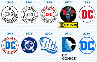
Here's a graphic of the many DC Comics logos over the years. The one labeled 1976 is the one with which I have the most collecting experience:
Monday, February 15, 2016
Rams Return to the Southland; Fans Debate Which Old School Color Scheme is Best
LA has a team again. My mother's team has returned. We're all just waiting for the official name to become "Los Angeles Rams of Inglewood." The home of Jules Winfield...
Anyway, the official logo has been circulating, and it's the same navy/gold look they used while in St. Loo, only it says Los Angeles. That makes a certain financial sense. They play for a season in the Coliseum wearing the (bad) navy and gold kits, sell a ton of merch, then make the switch and start selling more.
The question around these parts, as the Southland is still where the Caliboy Network is located, is which of the two main old school looks the Rams should focus on. The first:
The classic white and blue, similar in design to the Colts (against whom they're playing in this photo). I like it. I certainly like it more than their current navy and gold.
I just don't like it as much as the classic yellow and blue:
Now we're talking.
I've heard rumblings that the pattern will be: 1) Sell as much navy/gold gear as possible; 2) move to Inglewood, change back to blue/yellow; 3) use the blue/white as alternates and try and sell as much of that gear as possible.
The common thread between those scenarios seems to be...
Subscribe to:
Posts (Atom)


