I grabbed a few more interlocking baseball logos, and I've got them listed by when they first really appeared.
The first is the Mets, a team that was created in 1962, but they use the old New York Giants' "NY", which predates the Yankees.
Another icon that showed up in this final form shortly after the Giants "NY" is the "StL" for the ST. Louis Cardinals.
Next is the iconic "LS" for the Dodgers. This particular design was from the local PCL Angel team that was displaced.
The Giants themselves have a pretty nice "SF", but they didn't lift the logo from the Seals team in the PCL.
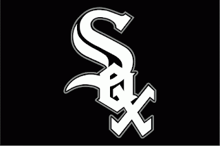
An old design used on and off for many years (and solidly for the past twenty), the White Sox actually have the team nickname spelled out in interlocking letters. I remember in school kids would use a Sharpie and blot out one of the white lines of the "O" to make the cap say "Sex" instead of "Sox".
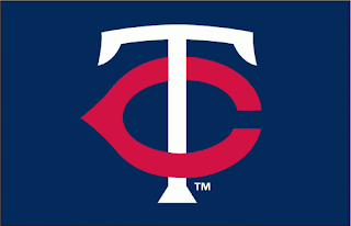
The Twins from Minneapolis/St. Paul. Minneapolis had the Millers (an "M") and St. Paul had the Saints (and an "StP") so what do you use to keep everybody happy? Well, a "TC" for "Twin Cities".
An expansion team in San Diego, the Padres just took the name from the original PCL team stationed there (uh...the Padres). Their "SD" is a little less blocky than the Giants' "SF".
And the newest team on the list or the Rockies. They have an odd one, having their region and their nickname represented on the logo--Colorado Rockies.
Missing? Kansas City and Tampa Bay, mainly because their barely crossing and aren't interlocking/overlaid. I'll be working with them later, along with the Chiefs from the NFL, as one of the few interlocking football logos.


ReplyDeleteGTAcrete is the top concrete contractors Toronto which offers efficient installation and maintenance services. We offers Interlock and pavement,concrete driveway,concrete Sidewalk,Concrete Foundation,Decorative concrete,Stamped concrete,polished concrete,outdoor kitchens and demolation and Excavation.