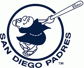
One of the alternate logos used in San Diego for the Padres during their early years showed a monk in a robe swinging the bat:
I like the sandals. You can see in the first example the colors scheme as well, the mustard and brown.
In this next alternate logo, the Padres have brought back the free-swinging monk. Having brought him back just this year, you can see the color scheme change to the current dark blue regime, and the word font on the bat also shows signs of the new script:
They'd used other representations of the bat-wielding "padre" in between these two, but part of the new design ethos is finding the old stuff, the hopefully beloved stuff, and tweak it slightly. The one in between that I'm not showing was less caricature and more human looking.
I never hated the Padres, and find both of these kinda cool.


No comments:
Post a Comment